Overview
What is SAMC? UC Davis’ Student Affairs Marketing and Communications (SAMC) department is an internal marketing organization directed towards students to foster community and providing the best UC Davis experience possible. Through creative means, they promote and educate UCD students about various campus resources and events with the intention to support their life goals.
I was recently hired by SAMC as a student designer around May 2022. I was one of two student graphic designers a part of the team. I worked with my manager, Jennifer Vaughn, who is the Creative Director at SAMC.
- Must be relevant to the undergraduate student body populations
- Cannot be triggering content
- Focus on a holistic mental well-being rather than a targeted symptom
The problem
A new name with no look
I was approached by my manager early June, as the Spring Quarter had just ended, ushering in summer vacation and its heat. UC Davis's student mental health initiative, Each Aggie Matters, was being renamed Aggie Mental Health: student feedback showed the old name didn't say it was about mental health. The client knew what the campaign should say, but it had no visual identity: no logo, no iconography, no marketing materials, not even merch like sweatshirts or pens. Everything had to be built from scratch while staying inside the broader UC Davis brand.
Before
Each Aggie Matters
After
aggie mental health
The brief: it should feel…
- approachable
- accessible
- honest
- supportive
How might we engage the student population to participant in their mental well-being?
Design process
Words first, then a visual system
Because the campaign's message came before any visuals, I started with the copy and built the identity outward from there. These were the headlines on the shortlist:
- Your productivity does not determine your worth
- Have you taken a break today?
- Self-care is not selfish
- Be kind to yourself
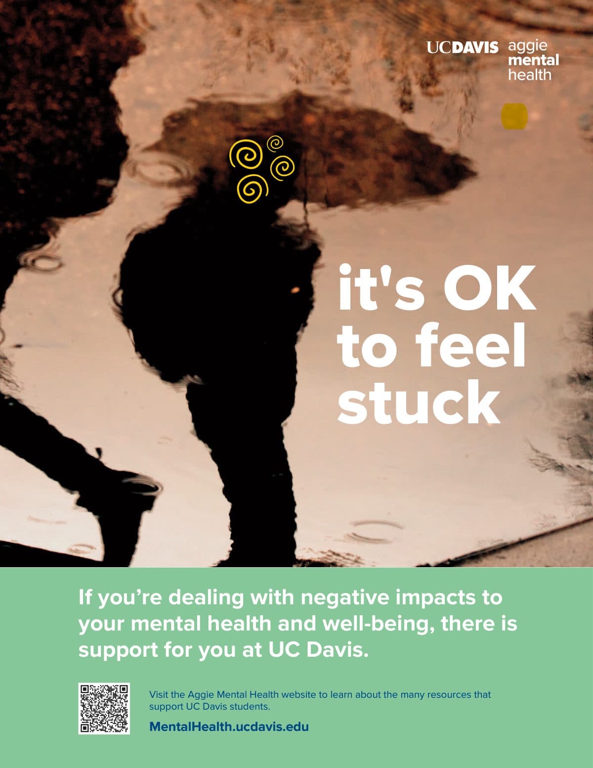
- It’s OK to feel stuck
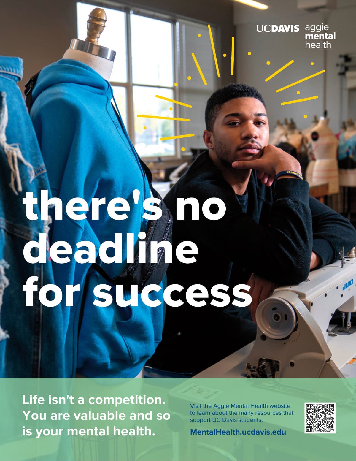
- There’s no deadline for success
- Strive for progress, not perfection
- You are worth it
- Watch yourself grow
Visual language
Drawn by hand, built to flex
I drew a library of doodles in Adobe Fresco with a monoline vector brush, then brought them into Illustrator. Each one is grouped so it can take any color in the palette, and every poster, screen and sticker pulls from the same set.
- Flowers
- Leaves
- Halo + dots
- Squiggles
- Organic shapes
- Stems
Color
Green leads, the rest keep it bright
The brief asked for green, and everything had to come from the UC Davis palette. Sage carries the campaign; Sunflower, Gunrock, Poppy and Rose are reserved for the doodles, so the headline always reads first.
Iteration
Trial and Error.
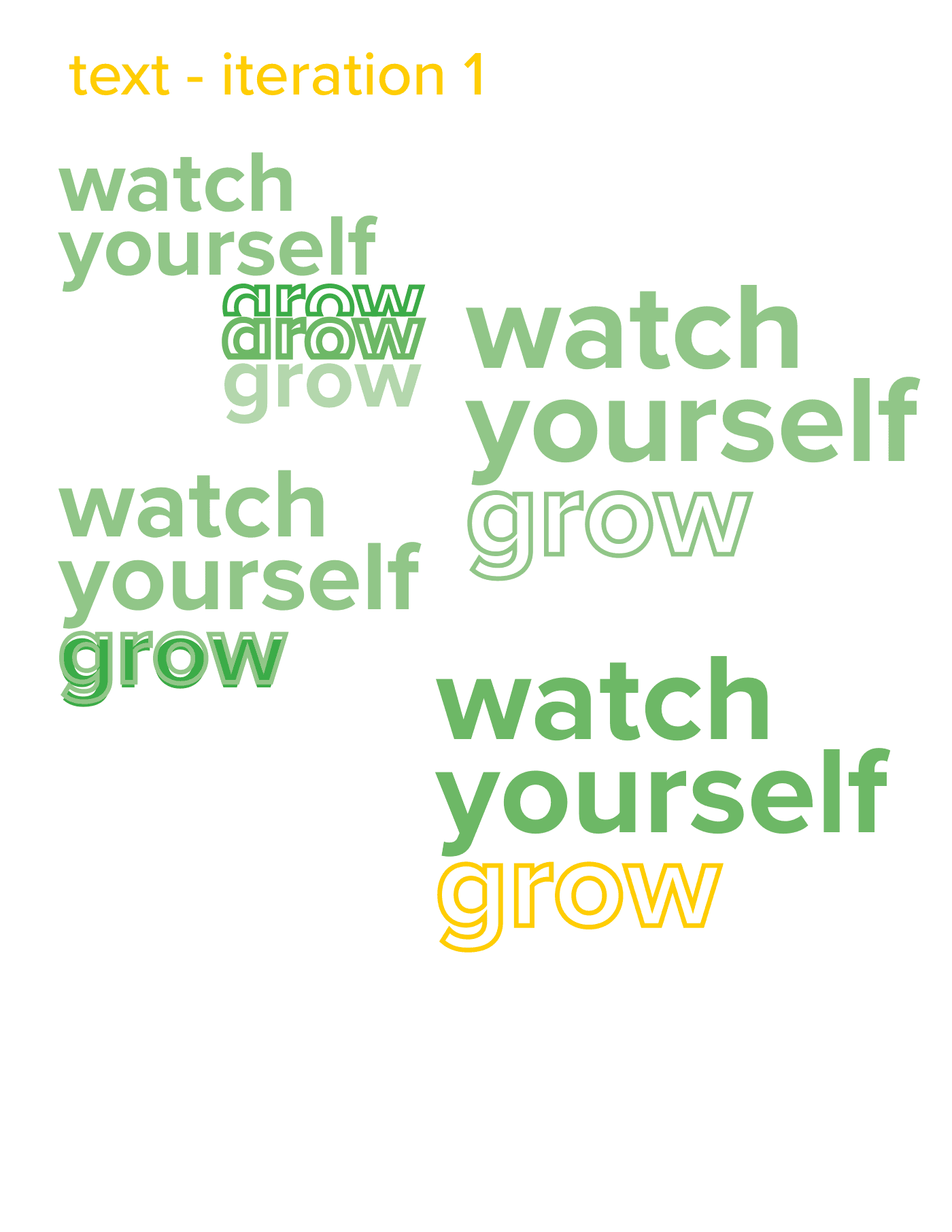
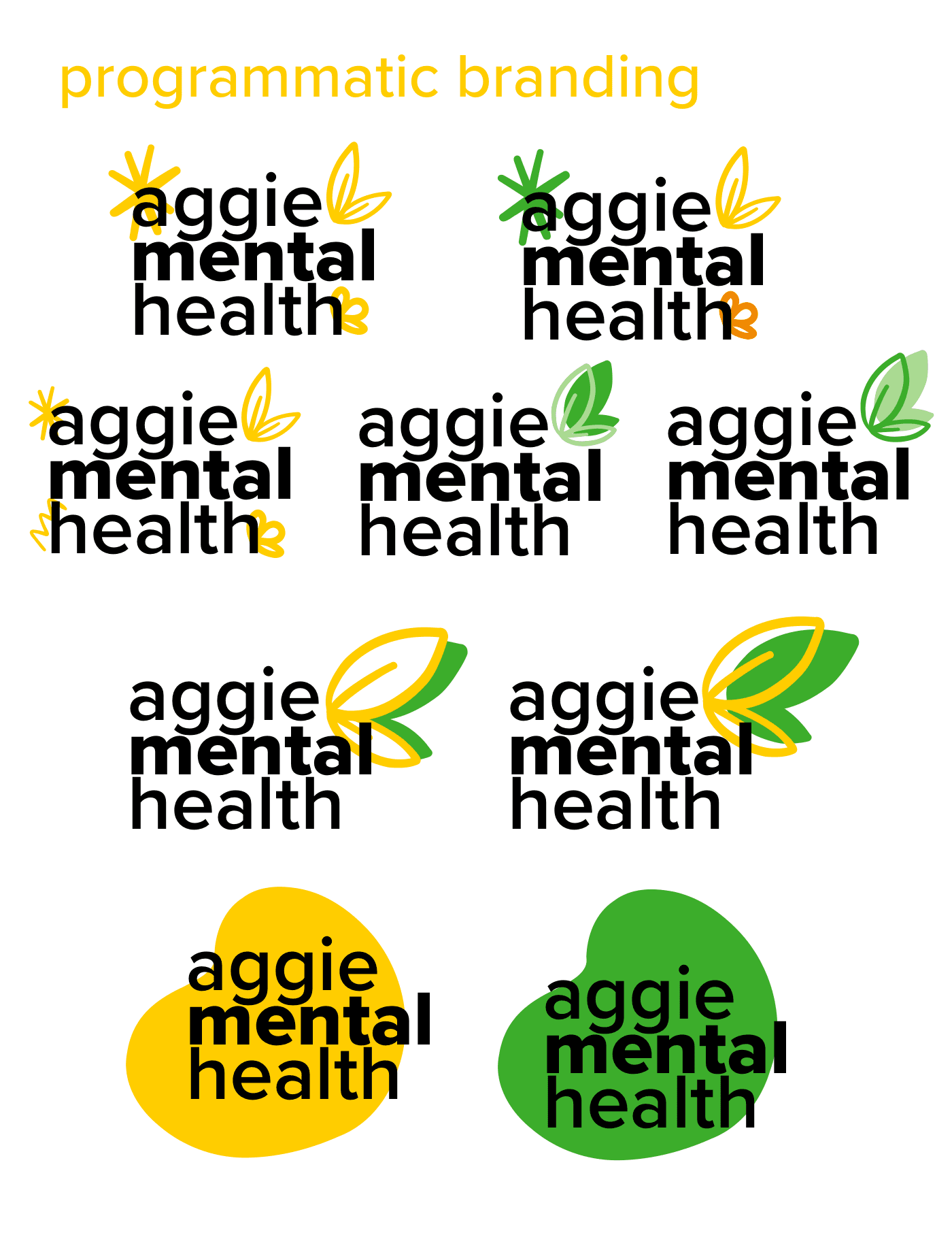
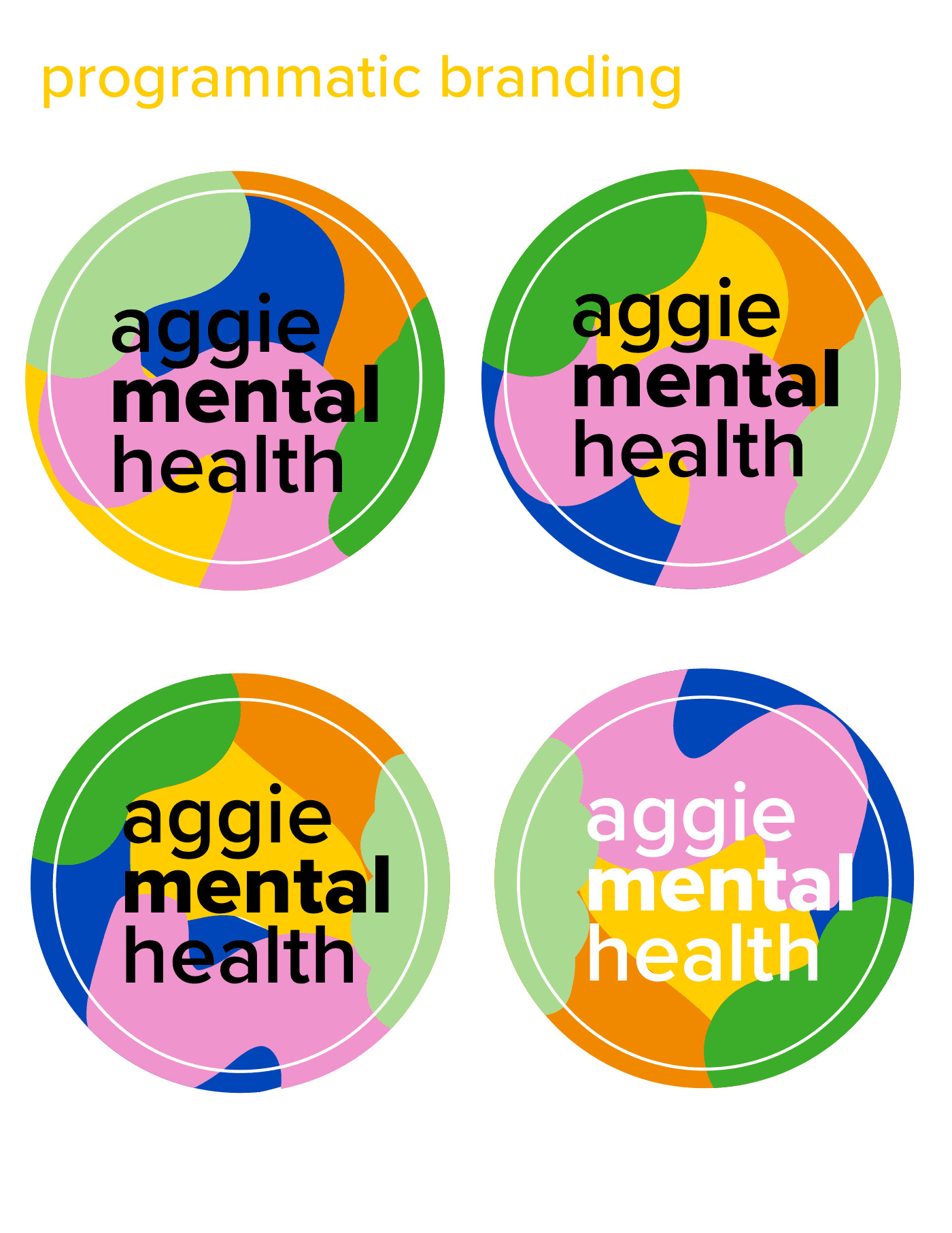
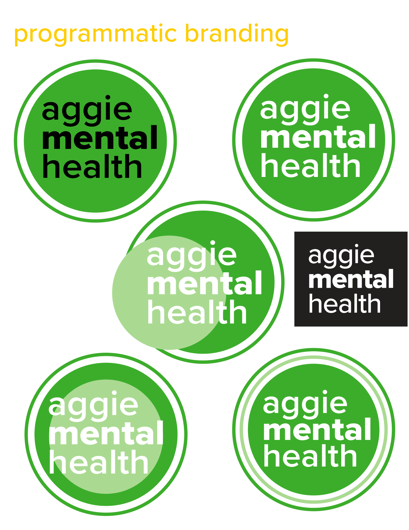
Not every direction landed. The hardest feedback I got was that a direction wasn't where the client wanted to go, even when I felt it connected with students. The bigger challenge was the limited palette and photo library. Working within those limits pushed me to balance clarity, consistency, and empathy, and to build a visual system that could carry the message on its own.
Final design
One system, many messages
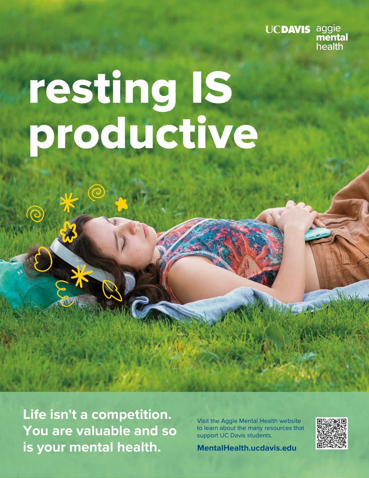
Every piece follows the same recipe: a photo from the UC Davis library with room above the student, a short lowercase headline, a doodle or two, and a sage band with the call to action and QR code.
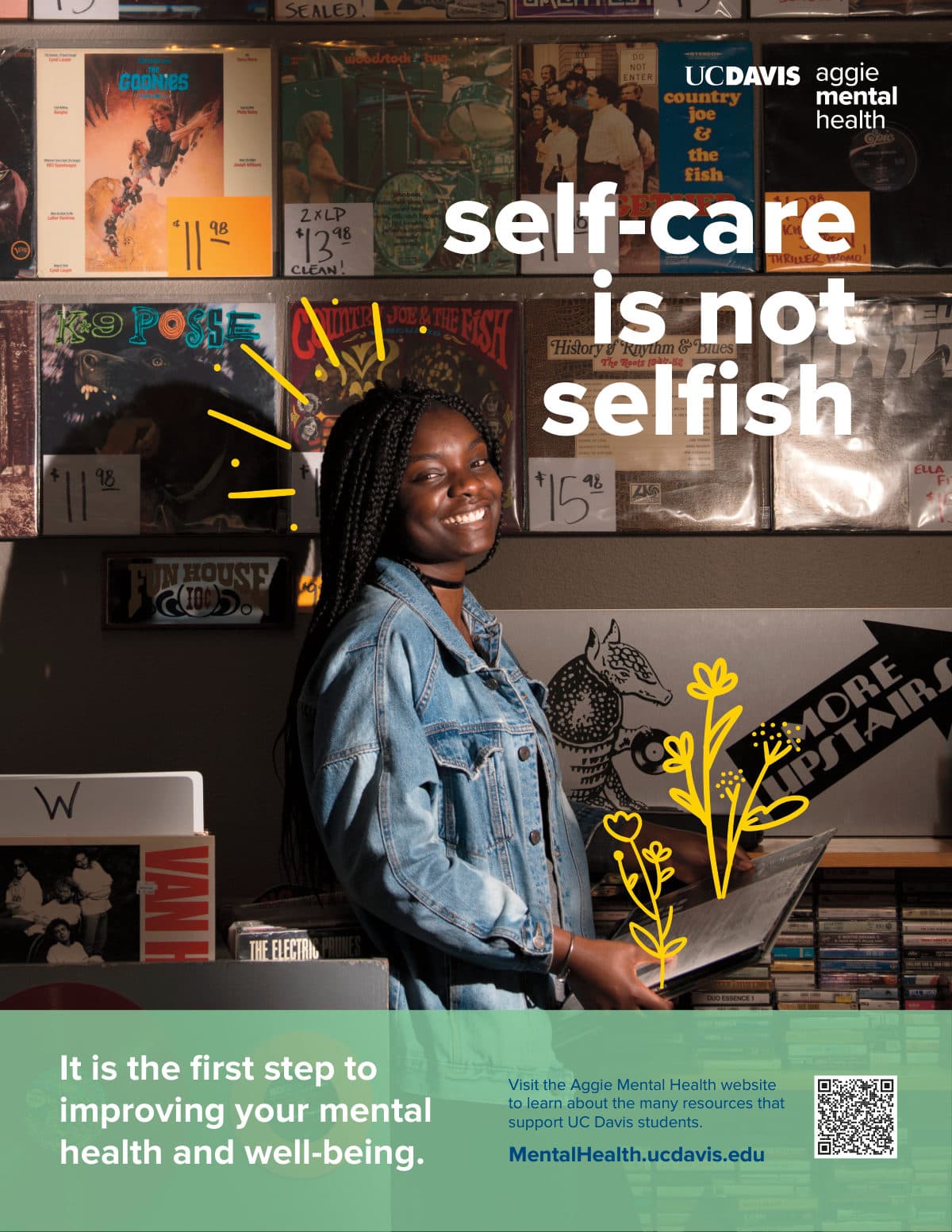
Rollout
Everywhere on campus
The campaign showed up all over campus: posters on elevator doors, on the sides of school buses, and at outreach tables in the Quad and other high-traffic spots a few times a quarter. The goal was to catch the eye and leave a gentle message behind.
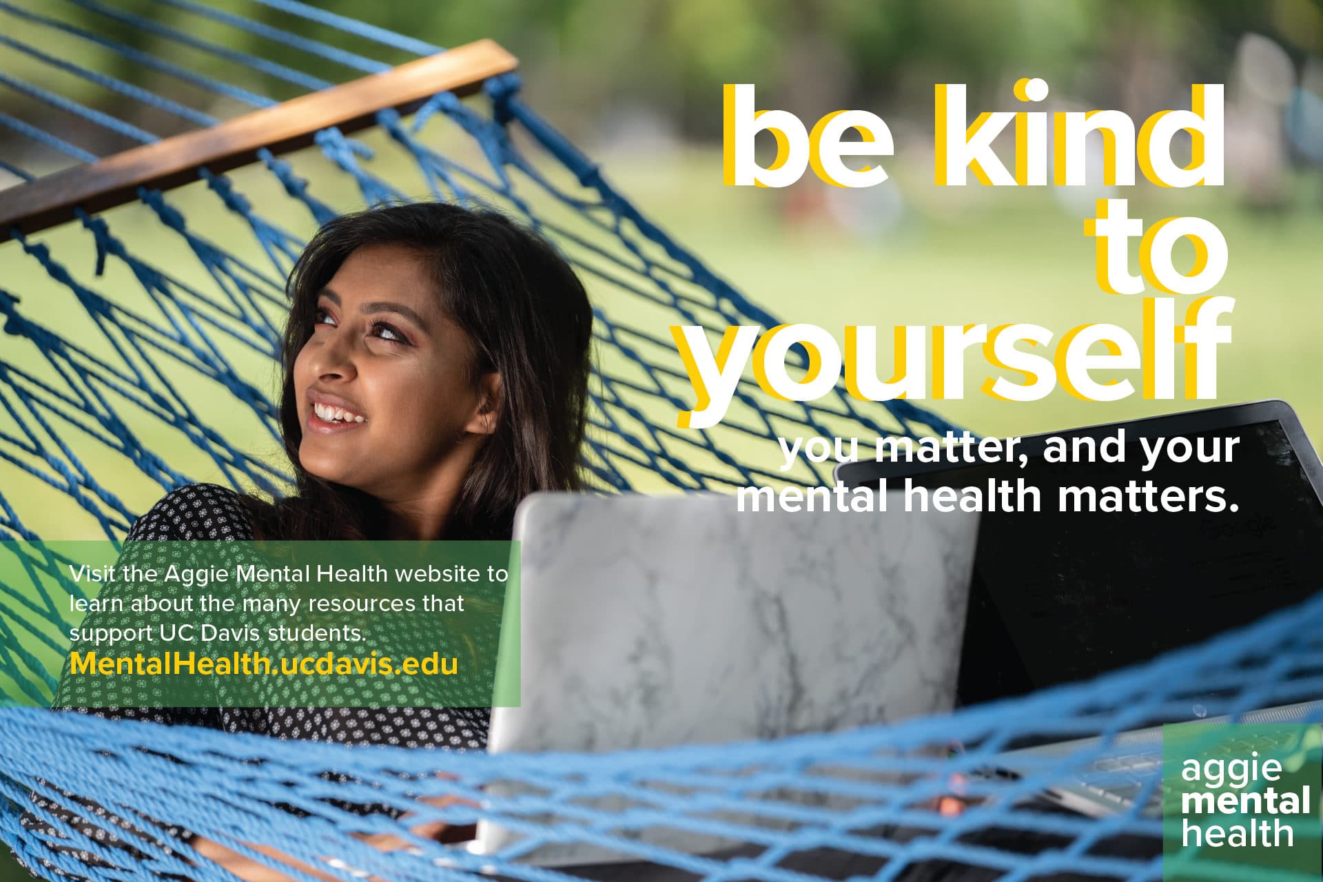 Campus LCD · be kind to yourself
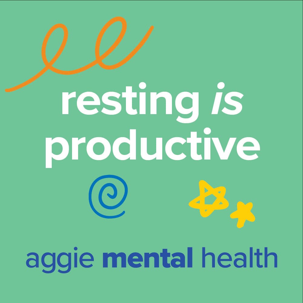 Social · Instagram square
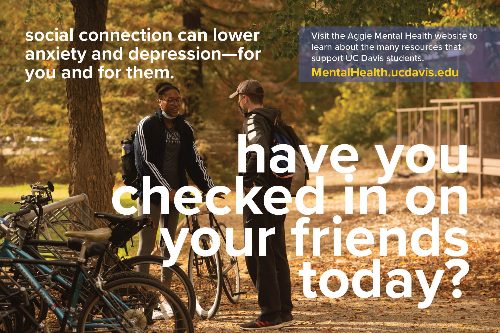 Campus LCD · have you checked in on your friends today?
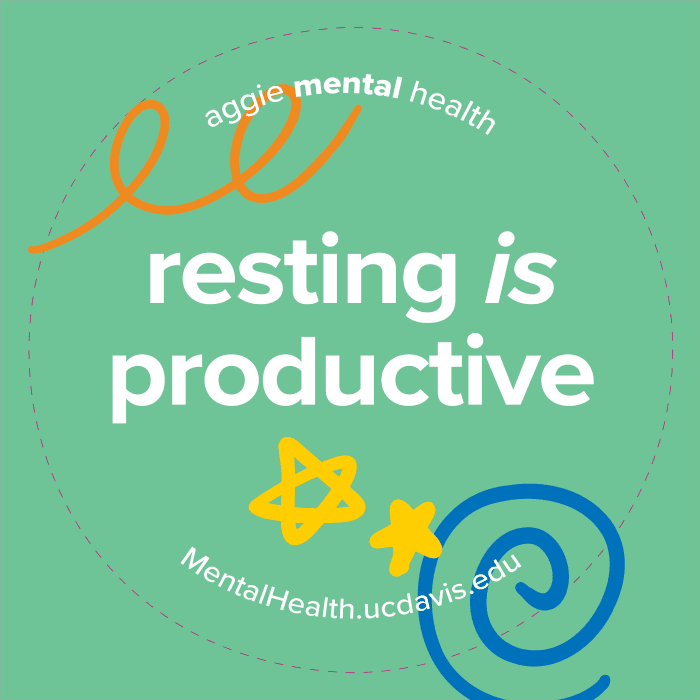 Sticker · Ambassador swag
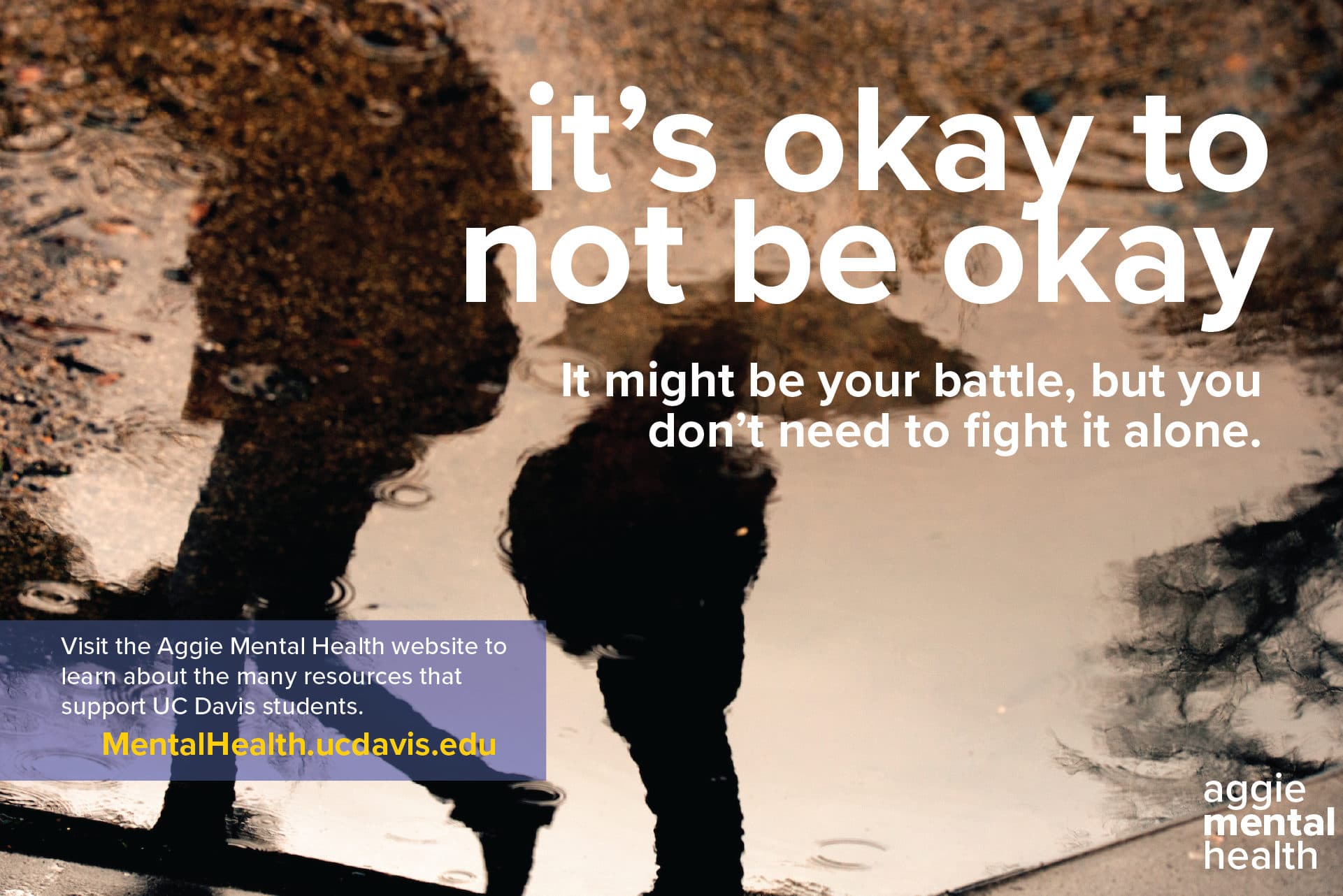 Campus LCD · it’s okay to not be okay
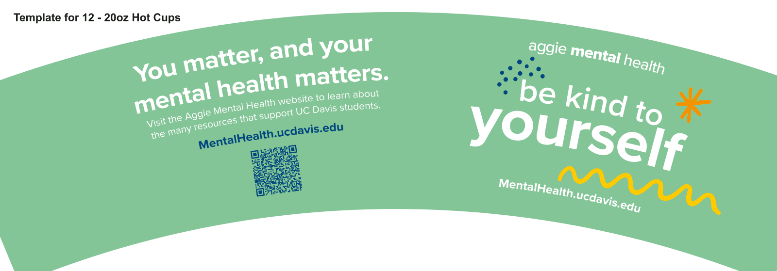 Print · Coffee sleeve
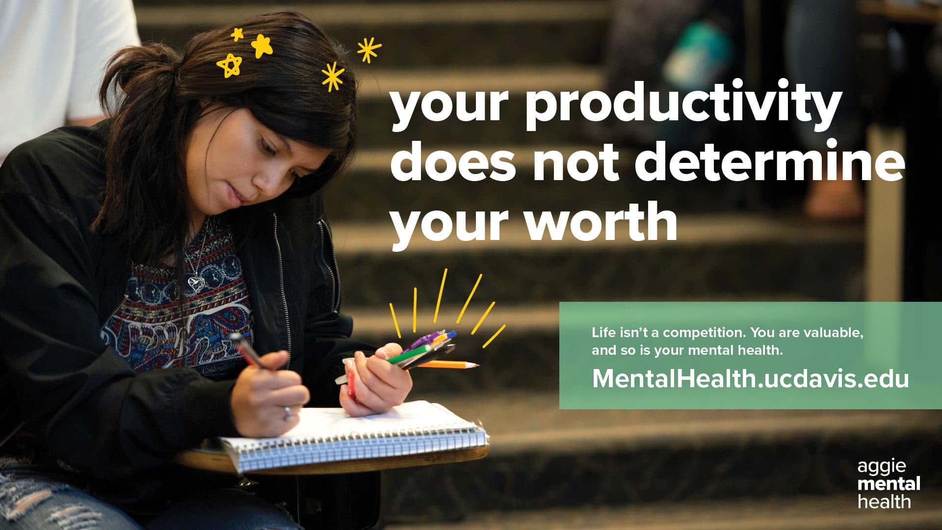 Campus LCD · your productivity does not determine your worth
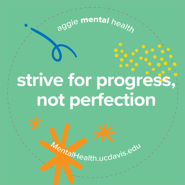 Sticker · Ambassador swag
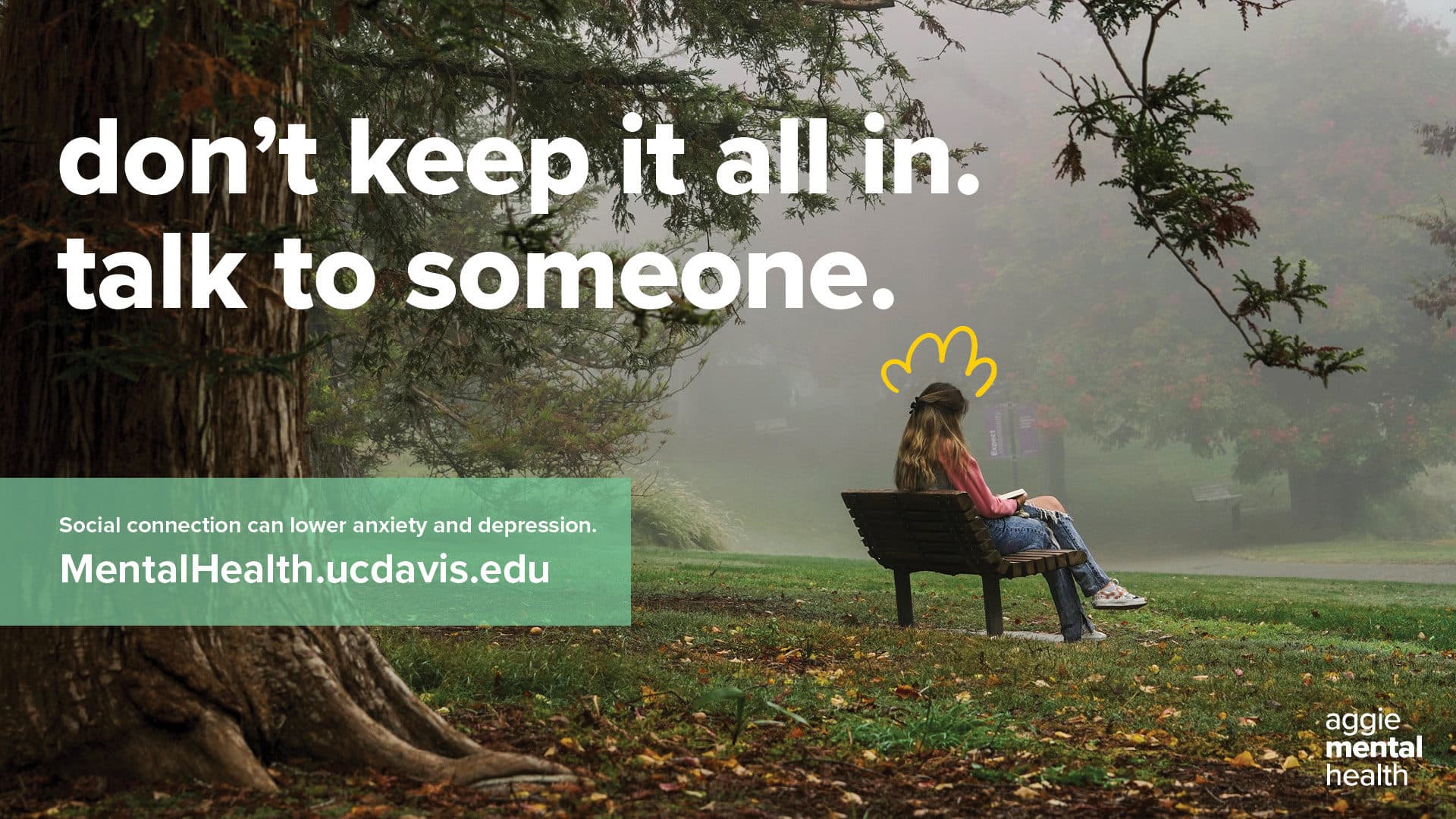 Campus LCD · don’t keep it all in
Reflection
What this project taught me
Lessons learned
- Criticism is about the work, not me. Early on it was easy to take feedback personally
- Tight brand constraints can sharpen a visual system instead of limiting it
- On a sensitive topic, tone matters as much as visibility
Next steps
- Add logo sketches, final files, and photos of the posters in the wild